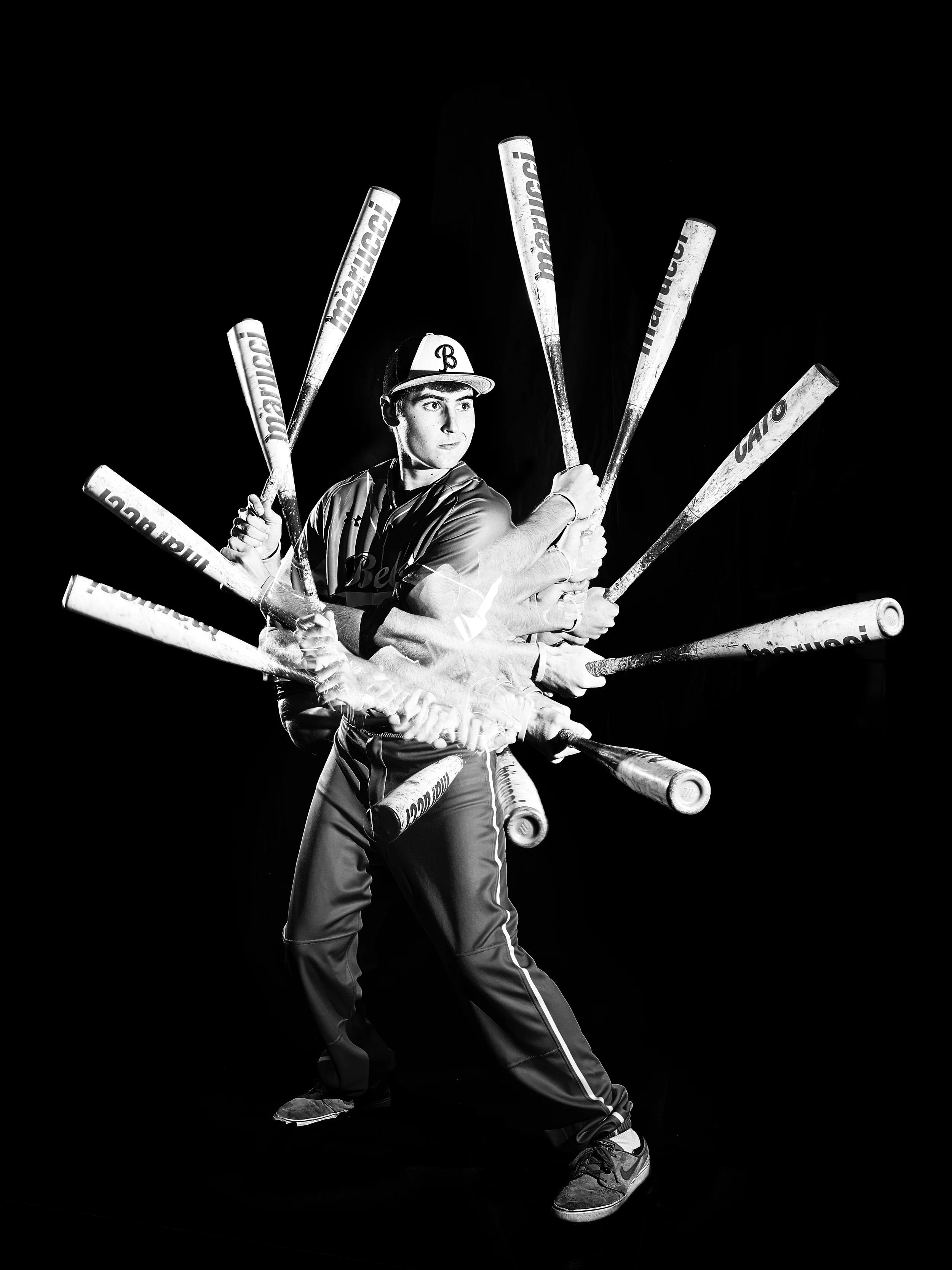
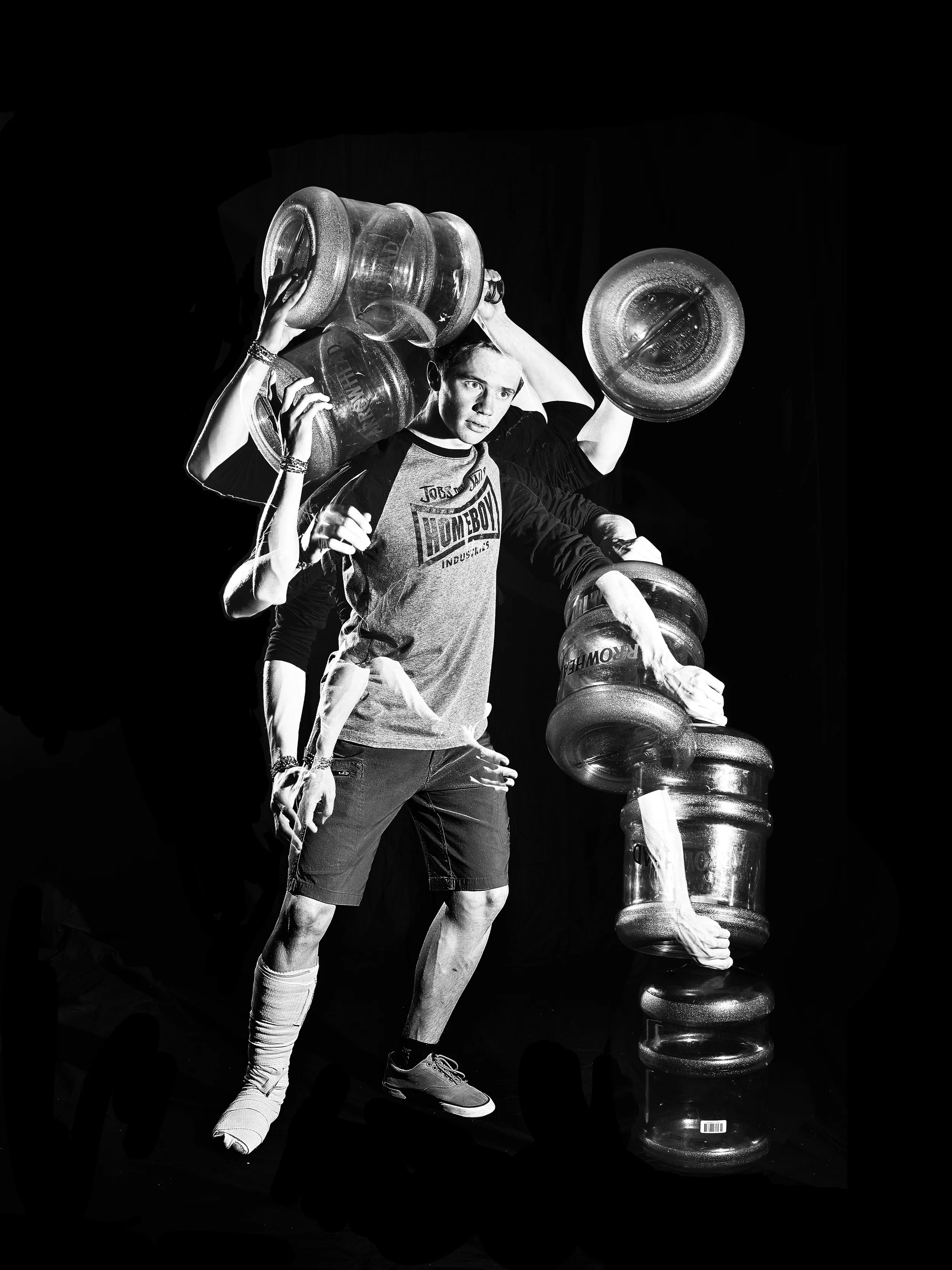
Last year we took photos for our divisions that blew people away. How can we top that this year?
The Problem
The interrupter spreads for the 2014-2015 Carillon Yearbook were one of the most lauded parts of the book. We knew going into this year that we wanted a similar layout: one person to represent each division with a special effect that helped convey our book's theme. Our theme was centered on journeys taken with our design style guide emphasizing long lines and circles, curves, and connected points.
The Solution
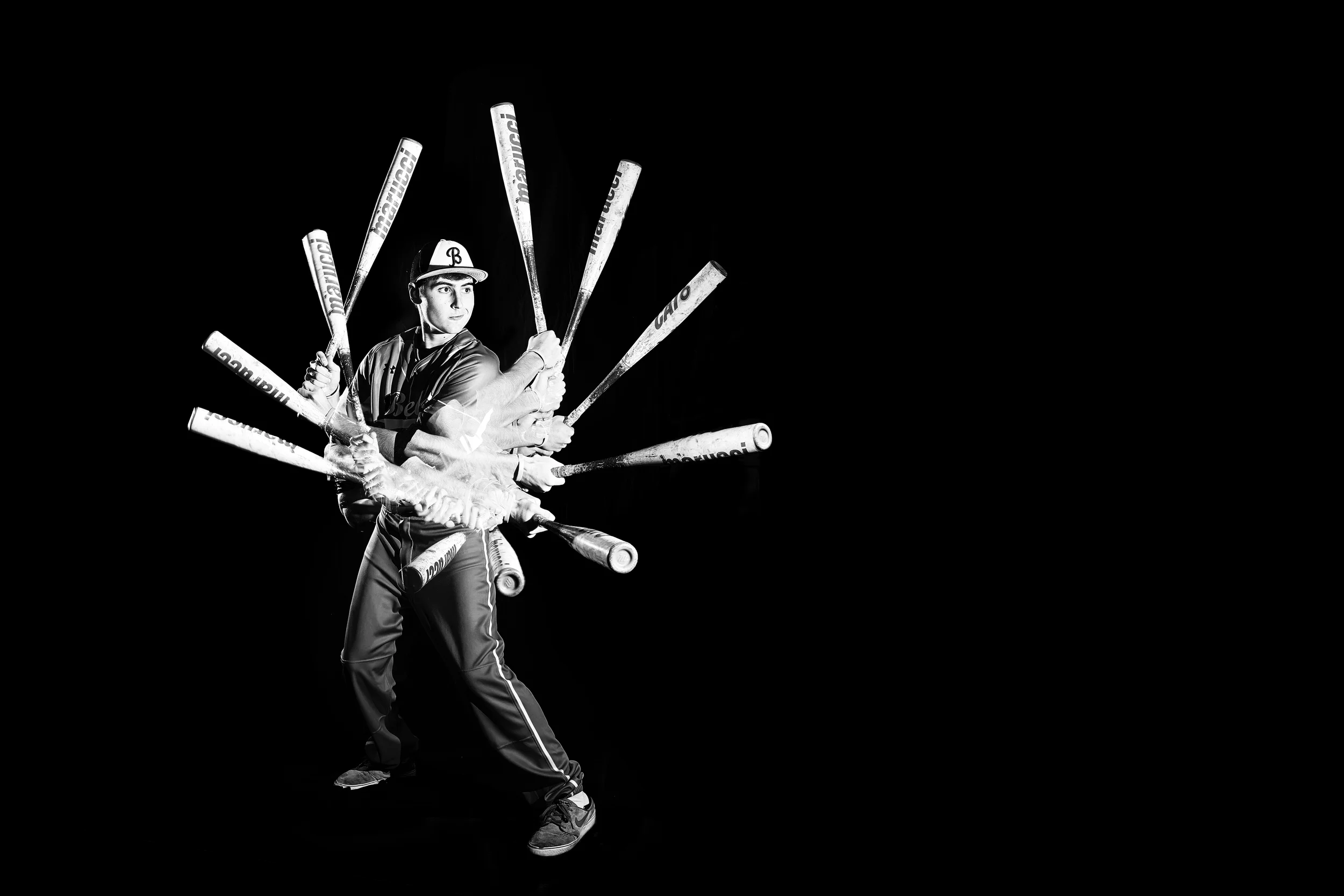
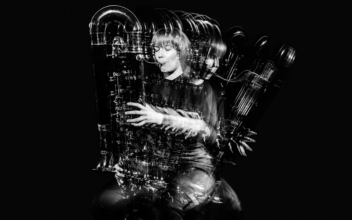
We looked online for inspiration, eventually settling on the work of BOND Creative Agency and their rebrand of the Helsinki Philharmonic Orchestra. The portraits specifically hit several important points for us. They let us choose a single person for each division, the exact format we were looking for, they had the fluid curve design element found throughout our book without the need for actual lines, and they allowed us to use props and an action to naturally give context to each person's connection with the yearbook section.
Shooting
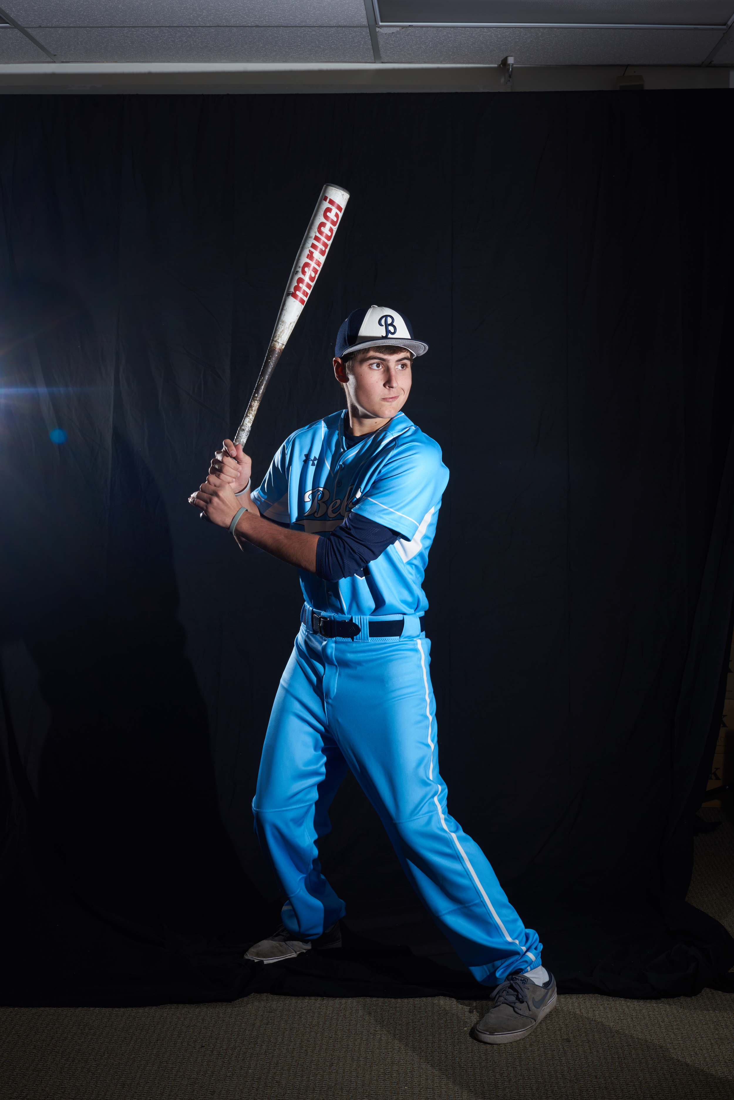
Portraits were accomplished with two flashes connected by Pocket Wizards to a Nikon D750 in front of a matte black cloth backdrop. One flash was positioned to the front right of the subject for the main light with another flash to the back left for a rim light to really separate the subject from the background. No diffusers or light modifiers were used to ensure the high contrast effect we wanted.
The most difficult part, besides post-processing, was shooting fast enough for each action to be fluid in the final result. We don't have quickly cycling strobes and our flashes have a cycle time of 2-3 seconds when shooting on manual 1/1 so I couldn't shoot quickly enough to get the 8-12 shots per movement I wanted. Instead, I approached each shoot either by having the subject repeat the action 5-6 times slowly or by having them move slightly and hold their position for each shot. Stationary props I shot separately without the subject in order to get the most effective lighting, they were then composited on top in post.
Post-Processing
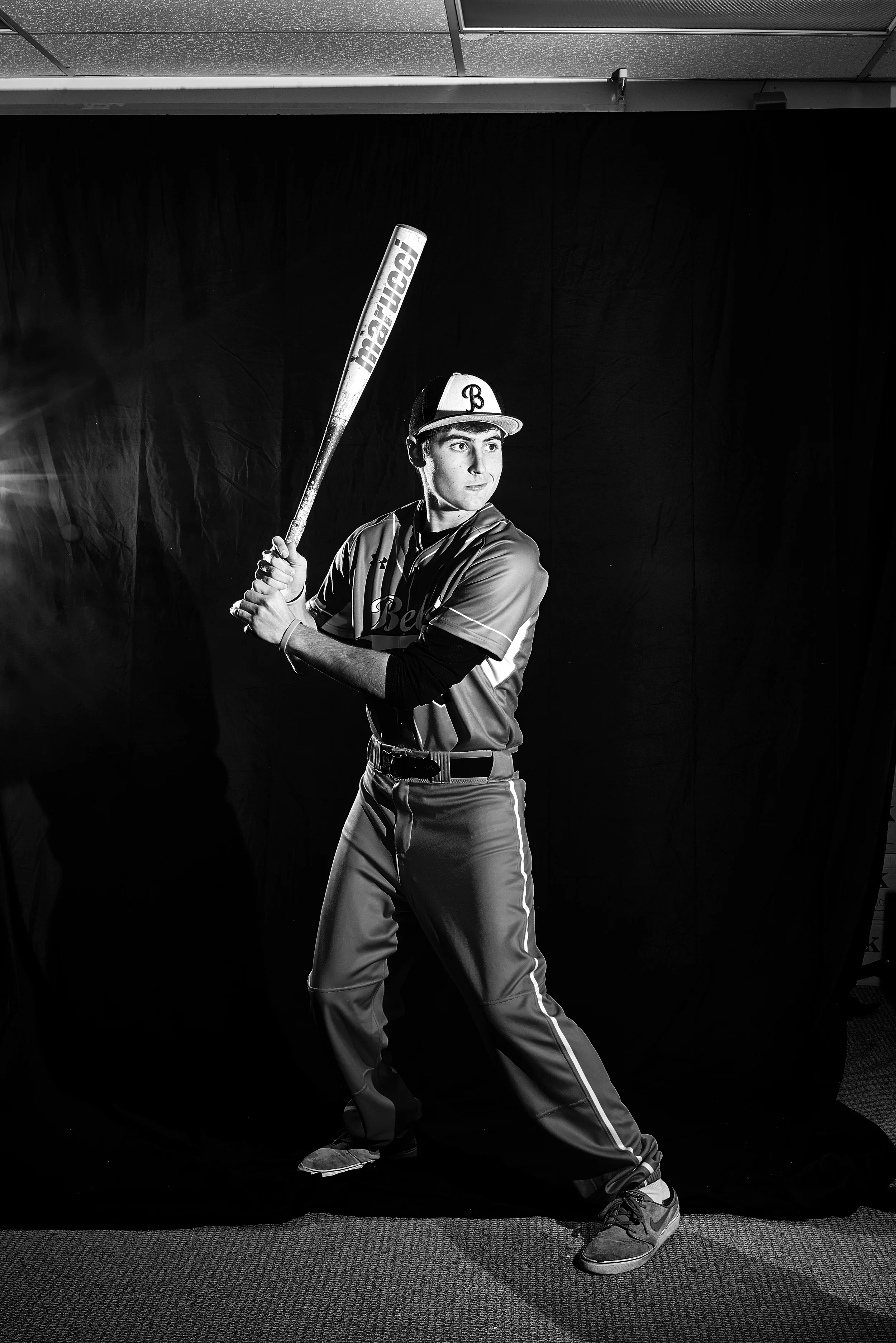
I used Capture One 8 to edit each set of photos and Photoshop to composite. The process was straightforward if not time consuming. Key points were to keep a nature exposure for the skin, the face especially, while increasing clarity and contrast. Finding a good level to bring out texture in the clothes was also important.
Each photo was brought into Photoshop to composite. I later found that using Photoshop's auto-align feature helped give a better place to start in positioning each photo. The blending option "Lighten" was chosen for each photo so only positive light values would show up giving a good overlap effect. Then each photo was cut out separately using layer masks, props shot separately were composited on, and final levels adjustments were made.
Here's a time-lapse to help illustrate the full post-processing process. Each photo took two hours more or less. For compositing I also used a Wacom Intuous Medium and Large to help create layer masks.
The Results
The resulting photos were striking and flexible enough for placement on spreads. We effectively conveyed our theme while stretching ourselves out of the design guidelines we set.
